 DuoApps









Vertical controls on iPhone Duo: when apps use them, and when they don’t
By default, they’re there: the system puts the toolbar, the tab bar, and navigation buttons on the side, except on the inner display in portrait. Apple also shows where they don’t go: an immersive interface that doesn’t scroll (Calculator), a sheet with a single button, a text item, and the columns of a split view (list and detail) other than the detail. On the inner display, an information-dense app can present its tab bar as a sidebar (Health).
What Apple shows
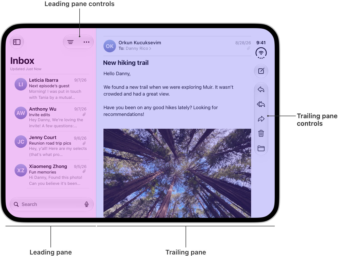
This image from Apple’s guidelines shows two options at once: the email’s column, along the edge of the screen, has its controls on the side; the list keeps its own horizontal, above it.

The options Apple shows
One row per option Apple shows in its guidelines, Tech Talks, and newsroom, with the condition Apple sets and the apps shown. Each row says who acts: the system (the default behavior), the app (it sets it screen by screen), or the designer (a design choice).
| Option | Condition Apple sets | Apps shown | Source |
|---|---|---|---|
| The default: controls on the side | The system places the toolbar, the tab bar, and navigation buttons on the side, with the status bar and the Dynamic Island: on the outer display in portrait and in landscape, and on the inner display in landscape. The inner display in portrait keeps horizontal bars. The app must be built with the latest version of Xcode, and its bars must come from the system’s navigation containers. See the pattern Where the bars go, rules 1 and 2. | Mail, Notes, Clock, Fitness; Podcasts and Games, to show what compresses when space runs short; Slack and Netflix, in their newsroom photos (inner display, landscape). | HIG, Vertical controls · “Design for iPhone Duo”, 5:27 · “Raise the bar”, 1:59 · “Raise the bar”, 3:15 · “Raise the bar”, 12:03 · “Raise the bar”, 12:14 · Apple Newsroom |
| Full width, no bars on the side | For a visual, immersive interface that doesn’t scroll and doesn’t need bars, for example a single-page app with a bottom-heavy layout. The app turns off the vertical bar on that screen and the content takes the full width, as long as nothing runs into the Dynamic Island or the status bar and no interactive element is hidden by the controls. See the pattern Where the bars go, rule 10. | Calculator, on the outer display. | HIG, Vertical controls · “Raise the bar”, 14:28 · “Raise the bar”, 14:37 · “Design for iPhone Duo”, 7:06 |
| A full-width background, inset content | Apple allows mixing full width and inset content: a background image or a header spans the full width, under the controls on the side, while the scrolling content stays inset, in the safe area. Every interactive element stays in that scrolling area, so nothing is covered. What runs underneath is the designer’s choice. See the pattern Don’t stretch, Article · Safe area and backgrounds. | No app named by Apple for this option. In its newsroom photo, the image in Netflix covers the whole inner display, under its controls. | HIG, Vertical controls · “Design for iPhone Duo”, 7:06 · Developer article, Optimize bars for vertical presentation · Apple Newsroom |
| A sheet with a single button | On the outer display, a sheet’s controls move to the side by default. If the sheet’s toolbar has only one button, like Close, the app can turn off the vertical bar for that sheet so the bar doesn’t take up space: the sheet then stops just short of the front-facing camera, and the status bar repositions itself. On the inner display, a centered sheet, its default position, keeps horizontal bars. See the pattern Where the bars go, rule 9. | No app named: a sheet whose only button is Close. | “Design for iPhone Duo”, 8:45 · “Raise the bar”, 14:37 · “Raise the bar”, 4:03 · “Design for iPhone Duo”, 9:10 |
| A text item, kept horizontal | Some items stay in a horizontal bar, the navigation bar: a text-only item, an item that switches between a symbol and text, a control too wide for the side (a text button, a segmented control), an app view with no vertical version. The system handles it on its own for an item with no icon and for the standard Edit button; for an app item that switches between a symbol and text, keeping it horizontal is up to the app. Apple asks you to keep as few of them as possible and to prefer a symbol, but adds that a button whose text carries information, like a cart button showing a dollar amount, is better kept in the horizontal bar. | Clock, with its Edit button. | “Raise the bar”, 8:05 · “Raise the bar”, 9:50 · “Design for iPhone Duo”, 6:15 · HIG, Vertical controls · Developer article, Organize items in your bars |
| Split view: only the detail column | On the inner display, a split view shows several columns, the list and the detail for example. The system puts only the detail column’s controls on the side, the column along the edge of the screen; the other columns, like an inspector, keep horizontal bars, near the content they affect. On the outer display, the split view collapses to a single column. See the pattern Where the bars go, rule 8. | Mail: the list’s controls stay at the top of the list. In its newsroom photo, Slack shows the same layout: the list of conversations keeps its controls above it, and the conversation has its own on the side. | “Raise the bar”, 3:36 · Developer article, Optimize bars for vertical presentation · HIG, Vertical controls · HIG, Split views · Apple Newsroom |
| The tab bar as a sidebar, on the inner display | By default, tabs stay on both displays, vertical when needed. On the inner display, an app with a tab bar can present it as a sidebar, for richer navigation. Apple notes that this isn’t for every app: it works best for information-dense apps. | Health. In its newsroom photo, Netflix keeps its controls on the side of the inner display, with no sidebar (see Full screen or a list alongside). | “Prepare your app”, 5:34 · “Design for iPhone Duo”, 8:23 · Apple Newsroom |
| Two columns, on the inner display | So that the inner display doesn’t just get a stretched-out iPhone app, Apple names three options: the split view, the tab bar as a sidebar, and a layout designed for the width. In the last one, a vertically stacked layout rearranges itself into two columns when there’s room. It’s a design choice. | Music, on the inner display. | “Design for iPhone Duo”, 7:34 · “Design for iPhone Duo”, 8:12 |
What Apple says about it
In general, Apple asks you to keep the default bar placement: most apps are good candidates, and controls in familiar positions help people understand how the app works right away.
Not every pose puts the controls on the side: Apple asks you to keep their relative positions as similar as possible from one pose to the next, so no one has to relearn where actions live.
On the side, the app’s controls share the space with the status bar and the Dynamic Island, which grows with Live Activities; when space runs short, the system moves some of the app’s controls into the overflow menu.
Apple asks that the keyboard’s accessory bar stay attached to the keyboard rather than move to the side.
A bar the app draws itself (a toolbar, navigation bar, or tab bar placed by hand) stays where the app puts it: the system doesn’t move it to the side. See the pattern If your app draws its own bars.
What the source doesn’t say
- Each app’s reasons: Apple says what each option is for, not why an app chose it. The captions of the Slack and Netflix photos say nothing about their controls.
- The other poses: most options are shown in a single pose. Apple doesn’t show, for example, the sidebar in Health partially folded or in Split View (two apps side by side).
- What can pass under the controls: Apple writes that scrolling content stays inset, in the safe area (guidelines); in the Slack photo in the newsroom, the photos in a message pass under the controls. Apple doesn’t say under what condition. The DuoApps recommendation: what doesn’t scroll never goes underneath, and what scrolls can, as long as every element can come back into the safe area (see the pattern Don’t stretch, List and grid · Safe area and backgrounds).
- The side of a bar the app draws: Apple doesn’t say how an app that doesn’t use the system bars knows that side. A DuoApps inference, which Apple doesn’t state: outside Split View, it’s the side of the status bar and the Dynamic Island (see the pattern If your app draws its own bars, rule 4).
- A threshold: Apple doesn’t say when an app is information-dense enough to present its tab bar as a sidebar.
Sources
- Designing for iPhone Duo, Apple Human Interface Guidelines, September 9, 2026
- Design for iPhone Duo, Apple Developer, Tech Talk
- Raise the bar with iPhone Duo, Apple Developer, Tech Talk
- Apple unveils iPhone Duo, Apple Newsroom, September 9, 2026
- Preparing your app for iPhone Duo, Apple Developer Documentation
- Prepare your app for iPhone Duo, Apple Developer, Tech Talk
- Mail icon: App Store, Apple
- Notes icon: App Store, Apple
- Clock icon: App Store, Apple
- Fitness icon: App Store, Apple
- Podcasts icon: App Store, Apple
- Games icon: App Store, Apple
- Slack icon: App Store, Slack Technologies, Inc.
- Netflix icon: App Store, Netflix, Inc.
- Calculator icon: App Store, Apple
- Health icon: App Store, Apple
- Music icon: App Store, Apple