 DuoApps




Full screen or a list alongside: how to choose on iPhone Duo
Apple gives one criterion: the relationship between the two views. When one serves as the background for the other, like a video under its playback controls, the content takes the whole screen and the controls sit on top of it (overlay); partially folded, the two views move side by side. When one details the other, like a podcast’s transcript or a player’s “up next” list, they stay side by side (split) and neither is ever hidden. The newsroom photos show both: Netflix full screen, Slack with its list alongside.
What Apple shows
Two photos from the September 9 newsroom, the device open, in landscape. Netflix: the image of a show fills the screen and runs under the controls on the right edge; no list alongside. Slack: the list of conversations on the left, the open conversation on the right; only the right column has its controls on the side.
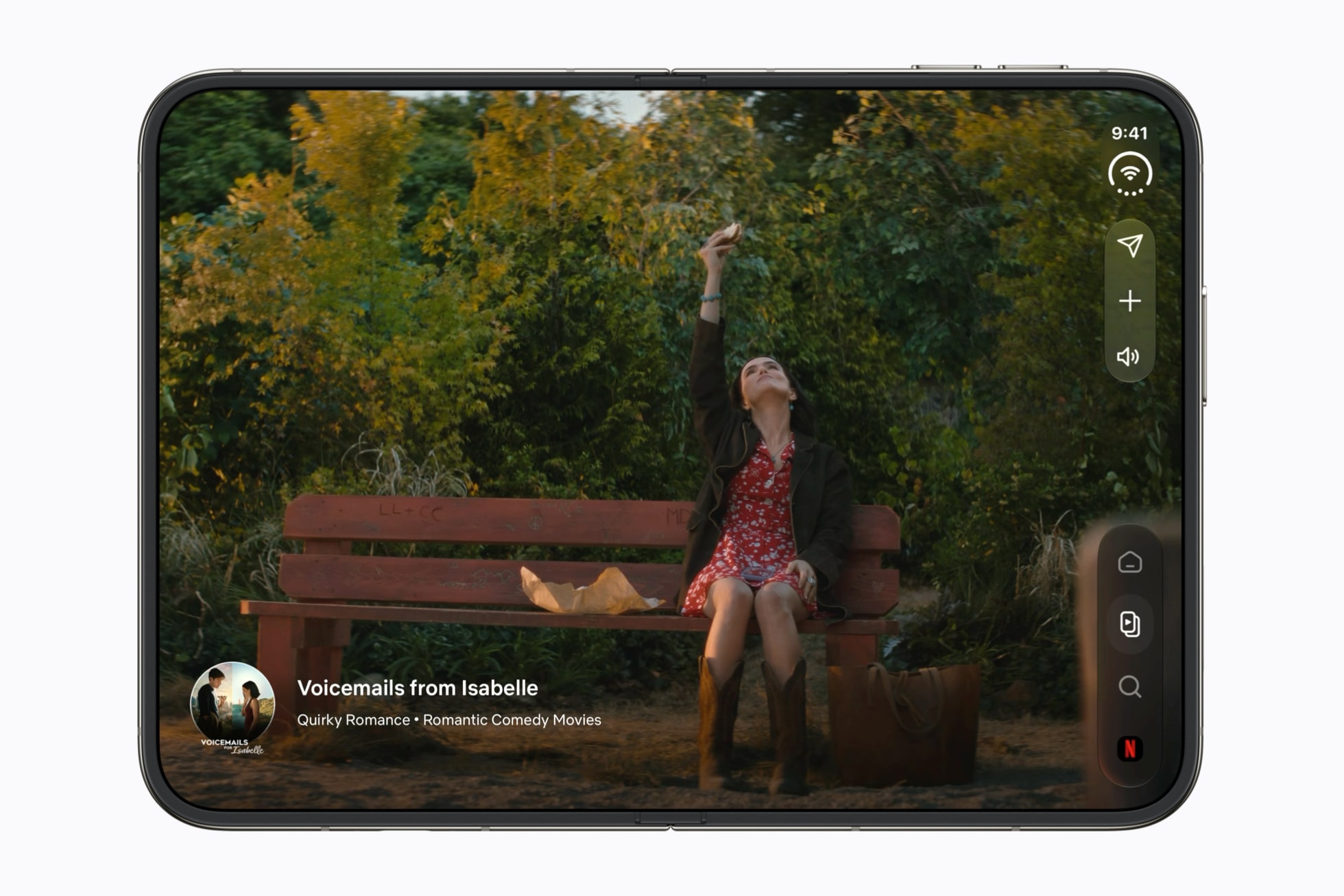
Full screen · Netflix
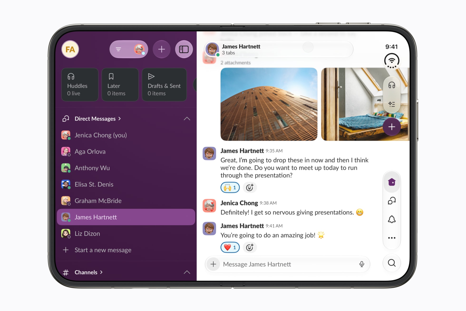
List alongside · Slack
The options Apple shows
One row per approach Apple shows or describes for the inner display, with the condition Apple sets. “A list alongside” here means a list column next to the content, as in Slack or Mail: what Apple calls the sidebar of a split view. Apple also uses the word for a tab bar presented as a column (last row).
| Option | Condition Apple sets | Apps shown | Source |
|---|---|---|---|
| Content full screen, controls on top (overlay) | When one of the two views serves as the background for the other: the controls in the foreground, the content behind. Apple gives it for media players, where the playback controls sit on the video. Closed or fully open, the views are layered; partially folded, they move side by side. | Accessibility Reader (Tech Talk Strike a pose) | “Strike a pose”, 15:00 · “Strike a pose”, 15:14 · ArrangementView · Developer article, Arrange views in different poses · “Strike a pose”, 13:51 |
| Content and what details it, side by side (split) | When one of the two views details the other and neither should ever be hidden. The views sit side by side when the space is wider than it is tall, and one above the other otherwise. If the app limits the split to one axis and the space doesn’t allow it, only one view stays on screen. | Podcasts, the player and its transcript; an audio notes app, the player and its “up next” list (Tech Talk Strike a pose) | “Strike a pose”, 15:31 · “Strike a pose”, 15:49 · “Strike a pose”, 12:13 · “Strike a pose”, 12:33 |
| A list and its content, side by side (split view) | A design decision: on the inner display, show one more level of hierarchy when the content suits it. The bars stay horizontal above the list; only the detail column has its controls on the side. | Mail, Notes; Slack, newsroom photo | HIG, Best practices · Developer article, Optimize bars for vertical presentation · Apple Newsroom |
| Full-bleed content, no list alongside | Background elements, like full-bleed artwork, can fill the available space and extend behind the bars; interactive controls stay within the safe area. | Netflix, newsroom photo | “Prepare your app”, 6:37 · “Prepare your app”, 6:59 · Apple Newsroom |
| Full width, no bar on the side | The app sets it, for a visual, immersive interface that doesn’t scroll, as long as nothing conflicts with the Dynamic Island or the status bar and nothing interactive is hidden by the controls. | Calculator | HIG, Vertical controls · “Design for iPhone Duo”, 7:06 |
| The tab bar presented as a column (Apple’s other sidebar) | The app sets it, on the inner display, for richer navigation. Apple notes that this isn’t for every app: it works best for information-dense apps. | Health | “Prepare your app”, 5:39 · “Design for iPhone Duo”, 8:23 · “Design for iPhone Duo”, 8:30 |
Our hypotheses, criterion by criterion
Apple decides by the relationship between the two views, not by the type of app. Two more criteria, which the source doesn’t show: bets, with the Hypothesis badge, to test against the apps as they come out.
| Criterion | Our bet | The Apple rule behind it | What would prove it wrong |
|---|---|---|---|
| How often the app publishes | An app that publishes a lot (videos, articles, messages every day) keeps its list visible next to the content on the inner display: the list shows what’s coming in. An app with a steadier catalog lets the content take the whole screen, with the list one gesture away. Hypothesis | Side by side when one view details the other and neither should be hidden, like a player’s “up next” list. Based on: “Strike a pose”, 15:31 · “Strike a pose”, 15:49 | Apps that publish a lot, shown full screen with no list; or apps with a steady catalog, shown with their list alongside. |
| What people come to do | When people come to choose (browse, compare), the list stays alongside. When they come to watch or read, the content comes first: the “up next” list stays beside the player, and full screen becomes a player option, for watching with nothing around it. Hypothesis | Full screen with the controls on top when one view serves as the background for the other, like a video under its playback controls; side by side for a player and its “up next” list. Based on: ArrangementView · “Strike a pose”, 15:49 | A video app that goes full screen by default, with no list, as soon as the device opens; or a player with no full-screen option. |
What Apple says about it
To choose, Apple first suggests following the patterns the app already uses: a side-by-side layout becomes a split arrangement, and a layered layout becomes an overlay.
With no existing pattern to lean on: an overlay when there’s a clear foreground and background relationship, like controls in front of text to read; side by side when one view details the other and neither should ever be hidden.
For a player and its “up next” list, Apple chooses side by side: the list details what’s playing; it isn’t its background.
An overlay suits full-screen experiences like media players, where the playback controls sit on the video; when the device folds, it can go from layered views to side-by-side views.
On the inner display, the extra space lets you show more content, like a sidebar; Apple asks you to show one more level of hierarchy if it makes sense for the content.
Background elements, like full-bleed artwork, can fill the available space and extend behind toolbars and sidebars; interactive controls stay within the safe area.
What the source doesn’t say
- A criterion tied to the type of app, how often it publishes, or what people come to do: Apple decides by the relationship between the views.
- Video with its list: Apple shows its criterion with an audio player and with Podcasts; no video app appears with its list alongside.
- Netflix’s reasons: the newsroom says what the app is going for, not why it has no list alongside.
Sources
- Apple unveils iPhone Duo, Apple Newsroom, September 9, 2026
- Strike a pose with adaptive layouts on iPhone Duo, Apple Developer, Tech Talk
- ArrangementView, Apple Developer Documentation
- Preparing your app for iPhone Duo, Apple Developer Documentation
- Designing for iPhone Duo, Apple Human Interface Guidelines, September 9, 2026
- Prepare your app for iPhone Duo, Apple Developer, Tech Talk
- Design for iPhone Duo, Apple Developer, Tech Talk
- Netflix icon: App Store, Netflix, Inc.
- Slack icon: App Store, Slack Technologies, Inc.
- Mail icon: App Store, Apple
- Podcasts icon: App Store, Apple
- Health icon: App Store, Apple