 DuoApps
Calculator on iPhone Duo: what Apple shows
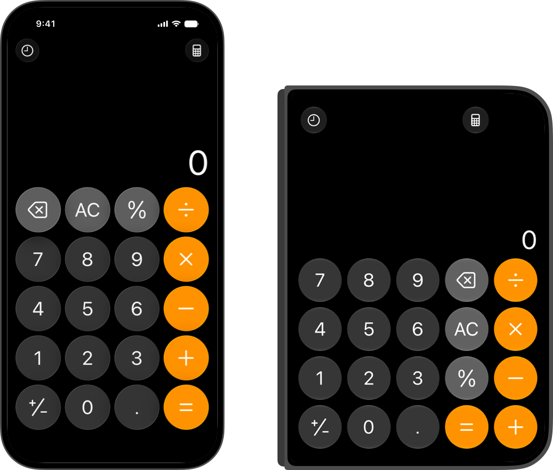
Apple shows Calculator on the outer display of iPhone Duo: the app takes the full width of the screen, with a keypad of five columns of four keys, compared with four columns of five on iPhone 16. Apple cites Calculator as an example of an app that can do without controls on the side (vertical controls): a single page, visual, that doesn’t scroll, with a bottom-heavy layout.
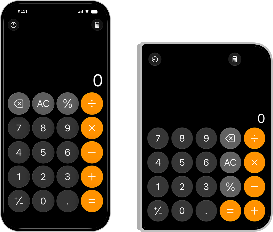
What it illustrates
- Where the bars go · Rule 10
Calculator is one of the two cases Apple names where an app can turn off the vertical bar (Raise the bar with iPhone Duo, 14:28); the other is a sheet whose toolbar has only one button. - Don’t stretch · Full screen: map, player, web view, camera · Bars
This check restates the condition the HIG sets with the Calculator example: the full width for a visual interface that doesn’t scroll, with nothing interactive covered; otherwise, the default bar placement.
What Apple says about it
When an interface doesn’t need bars, Apple suggests using the full width of the display. That works well for visual, immersive interfaces that don’t scroll, as long as nothing conflicts with the Dynamic Island or the status bar. Calculator, for example, takes the full width of the display.
Most apps are good candidates for vertical bars; a few can turn them off. For a single-page app with a bottom-heavy layout, like Calculator, Apple suggests considering whether a horizontal layout would let the content fully expand. The app turns off the vertical bar, screen by screen.
On the outer display, most content is inset so the controls on the side don’t hide it. Some interfaces still take the whole screen, with no inset: immersive, highly visual interfaces that don’t scroll, provided no interactive element is hidden by the controls.
The two approaches combine: a background image or a header across the full width, and inset scrolling content that holds every interactive element, so nothing gets covered.
In general, Apple asks you not to override the default bar placement: the position of controls on the vertical axis is one of the core patterns of iPhone Duo, and controls in familiar positions help people understand the app right away.
What the source doesn’t say
- The other displays and poses: Calculator on the inner display, open or partially folded. The HIG only shows the outer display.
- The switch to five columns of four keys: Apple doesn’t comment on it; only the image’s description mentions it.
- Where the status bar and the Dynamic Island sit when Calculator takes the full width: Apple sets the condition that nothing conflicts with them, without describing how the app meets it.
- The Calculator team’s own reasons: Apple gives the general condition (a single page, visual, that doesn’t scroll), not the detail of its choices.
FAQ
Why does Calculator take the full width of the screen on iPhone Duo?
Apple cites it as an example of a single-page, visual, immersive interface that doesn’t scroll: in that case, the app can do without controls on the side, as long as nothing conflicts with the Dynamic Island or the status bar (Human Interface Guidelines).
Can my app do without the bars on the side on iPhone Duo?
In general, no: Apple asks you to keep the default placement. Apple names two exceptions: a single-page, visual app that doesn’t scroll, like Calculator, and a sheet whose toolbar has only one button (Where the bars go, rule 10).
Sources
- Designing for iPhone Duo, Apple Human Interface Guidelines, September 9, 2026
- Raise the bar with iPhone Duo, Apple Developer, Tech Talk
- Design for iPhone Duo, Apple Developer, Tech Talk
- Calculator icon: App Store, Apple