 DuoApps
Netflix on iPhone Duo: what Apple shows
In the photo Apple published, Netflix fills the inner display of iPhone Duo, in landscape: the image of a show fills the whole screen and runs under the controls. The controls sit on the right edge, in two groups: three buttons at the top, the tab bar at the bottom. No sidebar. Apple says what Netflix is going for, not why the app is built this way.
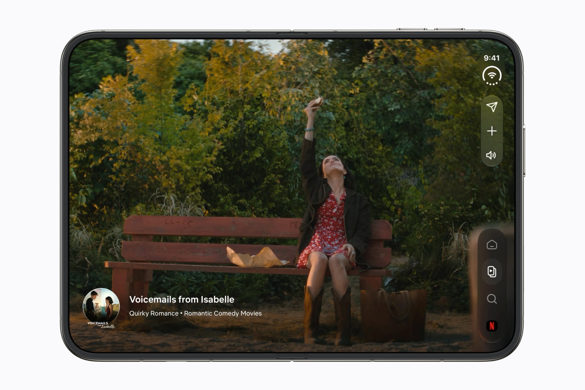
What it illustrates
- Where the bars go · Rule 2
The inner display in landscape is one of the three cases where the toolbar and the tab bar move to the side. - Where the bars go · Rule 7
Three buttons at the top, the tab bar held at the bottom, a space between the two groups. - Don’t stretch · Full screen: map, player, web view, camera · Safe area and backgrounds
A DuoApps recommendation: the image runs to the edges and under the controls, while the show’s name, at the bottom left, stays in the safe area. - Full screen or a list alongside: how to choose on iPhone Duo
Content full screen, with no list alongside: this page sets Netflix next to Slack and the criterion Apple gives for choosing.
What Apple says about it
Apple names Netflix, along with Zoom and Slack, among the third-party apps already taking advantage of the foldable design: immersive experiences on the large display, and new ways to use iPhone Duo.
According to the photo’s caption, Netflix uses the versatility of iPhone Duo to make “finding shows even more fun and engaging”: people scroll through Clips on the outer display, or open the device for a more immersive experience on the large display.
On the inner display, the controls stay on the side in landscape, for a continuous experience from one display to the other; in portrait, the bars become horizontal again. The tab bar stays at the bottom.
Background elements, like full-bleed artwork, can fill the available space and extend behind the bars; foreground elements, like interactive controls, stay within the safe area.
On the inner display, an app with a tab bar can present it as a sidebar. Apple notes that this isn’t for every app, and that it works best for information-dense apps, like Health.
What the source doesn’t say
- Netflix’s reasons: the newsroom says what the app is going for, not why it’s built this way, or why its tab bar stays on the side rather than becoming a sidebar.
- The outer display: the caption mentions Clips on the outer display, but no photo shows it.
- The other poses: the inner display in portrait, the device partially folded or propped up on a table, Netflix in Split View next to another app.
- The app’s other screens, the player included: the newsroom shows only one, without naming it.
Sources
- Apple unveils iPhone Duo, Apple Newsroom, September 9, 2026
- Designing for iPhone Duo, Apple Human Interface Guidelines, September 9, 2026
- Raise the bar with iPhone Duo, Apple Developer, Tech Talk
- Design for iPhone Duo, Apple Developer, Tech Talk
- Prepare your app for iPhone Duo, Apple Developer, Tech Talk
- Netflix icon: App Store, Netflix, Inc.